Design Context
Friday, 6 February 2015
Thursday, 5 February 2015
COP 3 : Cover Ideas_
To start off the design process I began by drawing out a variety of different possible cover designs for the publication:
With the cover I wanted to produce something minimal and simple that reflected the concept of style over fashion.
The main focus of my designs was to show style over fashion, initially without using the word 'over' but as continued designing I did try some with the word 'over' in it.
On the whole I preferred the designs without the word 'over' in them. I also preferred the covers with the horizontal line, rather than the diagonal.
The cover I will take forward to produce digital and then print is the third in from the left on the top row.
COP 3 : Publication Content Images_
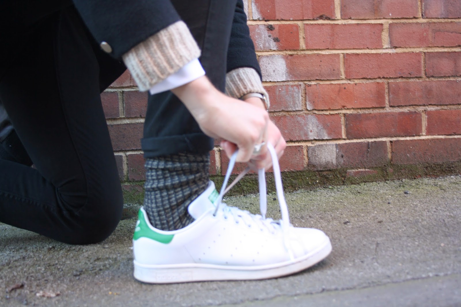
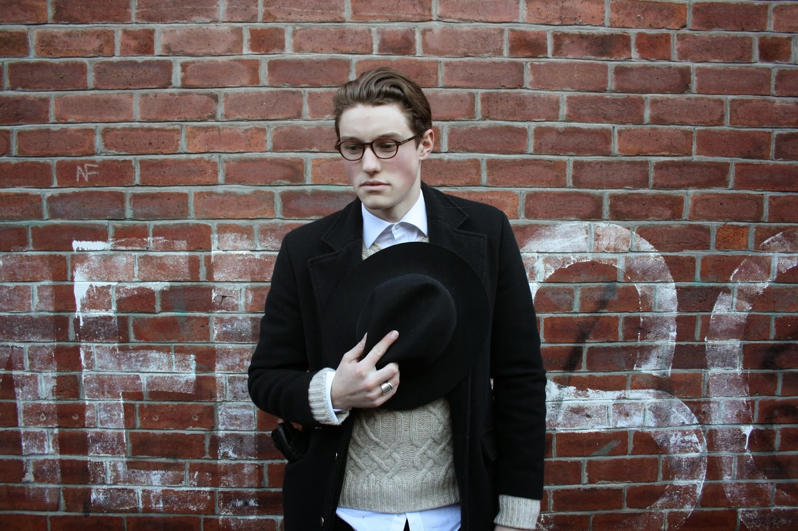
Once I had decided on the content I wanted to include, I went out and took some photographs to use in my personal investigation chapter but also throughout the publication. I wanted to use images I had taken to ensure reproduction quality and not have issues with copying rights.
Subscribe to:
Comments (Atom)


