To
improve the outcome of my double-page layout, I looked into magazine layouts
from nature magazines, such as National
Geographic. This gave me an insight into how articles of such nature are
laid out.
As well
as an insight into similar article layouts I also looked into successful,
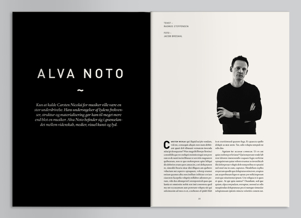
aesthetically appealing and interesting magazine layout. Although I looked into a variety of layouts, I focused on ones involving photographs and substantial body copy.


No comments:
Post a Comment