After
being given the brief I didn’t really have a clear idea of what I wanted to
produce my publication on. I knew that I wanted to move away from the content
of my essay and focus on fashion and specifically men’s fashion. With the title
of A Brief History of… I came up with
some initial ideas.
My
initial ideas were:
-
A
brief history of Adidas Originals.
-
A
brief history of Men’s (designer) Fashion.
-
A
brief history of Bespoke Tailoring.
-
A
brief history of the Lounge Suit.
-
A
brief history of Humor.
-
A
brief history of Men’s Fashion Icons.
From
these ideas I explored the possibilities that each one had. I found that a
couple of my original possibilities were too narrow and did not give enough
scope and that some were too broad and would be difficult to focus. The two
concepts I thought would be too narrow were both Adidas Originals and Humor and
the concept that I thought was too broad was A Brief History of Men’s Fashion.
I thought I could limit it to A Brief History of Men’s Fashion from the past
100 years but instead I chose to combine A Brief History of the Lounge Suit and
Bespoke Tailoring, focusing on the British elements.
With
my content idea in place I needed to research into the topic areas and gather
information.
I
primarily browsed the Internet to increase my existing knowledge on the
subject. I looked at existing articles on the history of both my topic areas
and found that I didn’t want to go right back to the origins of the suit as it
was the contemporary suit I was more interested in.
With
this in mind, I wanted some professional opinions on Bespoke Tailoring and
Suiting. To get this information, I emailed all of the tailors and Suit
makers/designers on Savile Row and the surrounding area.
I
emailed:
-
Ede
& Ravenscroft
-
Richard
James
-
Ozwald
Boateng
-
Meyer
& Mortimer
-
Chester
Barrie
-
Maurice
Sedwell
-
Drake’s
London
-
Norton
& Sons
-
Mark
Marengo
-
Henry
Poole & Co
-
Hardy
Amies
-
Richard
Anderson
-
Stowers
Bespoke
-
Scabal
-
Gary
Anderson
-
H.
Huntsman & Sons
-
Dege
& Skinner
-
Spencer
Hart
-
Nick
Tentis
-
Davies
& Son
-
Kilgour
-
William
Hunt
-
Gieves
& Hawkes
The
email I said read as follows:
Dear Sir or Madam,
I am a graphic design student at Leeds College
of Art and I am currently in the process of designing and producing a
publication on suits, specifically lounge suits. The publication will be a
sophisticated and creative look into the world of bespoke tailored suiting,
focusing on the heritage and its home, Savile Row, London.
As part of this project I aim to gather
information from professionals, which is the reason for sending you this email.
I would be very grateful if you could forward this email to your tailors so
that, if they can spare the time, they could answer my questions.
I have attached the questions as a word
document, a PDF file and at the bottom of this email as I was unsure as to what
platform would be best.
If there are any problems, concerns or you would
like some more information on what it is that I am doing, please don’t hesitate
to contact me. I will also be in London on the 5th & 6th
April, and intend to visit Savile Row and the surrounding area as further
research. Thank you.
Yours faithfully,
Jasper Lee
The
questions I wanted to know varied from what their idea suit was through to who
they thought wore a suit the best.
1.
What does a suit mean to you?
2.
What does a suit represent?
3.
Why did you choose to become a
bespoke tailor?
4.
How long does it take to learn
the skills required to be a bespoke tailor?
5.
What does it mean to be a
bespoke tailor on Savile Row/in London?
6.
How long have you been a tailor?
7.
What is your preferred suit? Cut//fabric//jacket//buttons//lapels//pockets//sleeves//vents//waistcoats//trousers
8.
What makes the perfect suit?
9.
How long does it take and
experienced tailor create a bespoke suit?
10. Which person, in the public eye, best demonstrates the qualities of
bespoke tailoring?
11. What are your specific essential accessories to your suite? Cufflinks//shoes//watch//jewelry//bag//overcoat//scarf//hat
12. Is the suit the ultimate attire for the Gentleman?
I only
received one correspondence, in the form of a phone call from Scabal. I had
previously planned a trip down to London, which would allow me to go to Savile
Row, experience what it is like, visit a Bespoke Tailor and ask my questions to
them directly. Whilst there, I would also be able to photograph the street and
the tailors.
When I
was down there, people were mostly happy to talk to me and answer my questions,
however, some places were closed as it was a Saturday, some said I required and
appointment and one said I was better talking to other people. I asked a
selection of my questions to all the people who were willing to chat with me.
The responses I received were as follows:
Davies & Son
1. Craft
// perfect on the customer // challenge of perfection
5. Global
// everything // 70% export // born into it
7. 13 oz wool // royal
– mid navy // English style // heavy cloth makes up nicer
10. David
Beckham // Ant & Dec
11. White
shirt // hank and tie always fit // collar bar // buttoned collar
12. Yeah
definitely, shoes are important too
Nick Tentis
1. Sophistication
// Class
3. Love
of nice clothes // Just asked a guy for a job
5. Prestige
// Know what you are doing // Quality
8. Simple
style // Good cut // Quality fabric // Good finish
10. David
Gandy // Gary Barlow // Dermot O’Leary
11. Plain
tie // Plain pocket hank // Shirt
12. Yes
Dege & Skinner
1. 1st
Impression // Carry it off // Guide // Relationship with customer
2. Confidence
// Image
3. Interest
in uniform (military)
4. Big
// Important // Lucky // Fortunate
7. Traditional
// Look better // Simple // Modern // Not over the top
10. David
Gandy
11. Pocket // Shirt //
Tie // Start with the suit, the shirt must then match the suit and the tie must
match the shirt and suit // Keep it plain // Everything will go with grey
12. Definitely // 3 piece
down to 2 piece // Range // Shirt can be worn with or without a tie, buttoned
or unbuttoned // Savile Row is Savile Row // It is its own place, unaffected by
trends
Scabal
1. Defines
a person // Individuality // Personality
3. People
interaction
7. Slim
lapel // Short jacket // Slim trousers // Adjustable waist
10. Rubinacci
// Morris Sidware
11. All
slim // Bit of colour // Hank // Classic shoes
12. Absolutely
Richard Anderson
-
If you have to ask the price,
you can’t afford it
-
Lifetime working on Savile Row
// Savile Row is like a home // A village
-
Quality shirt and shoes are
essential
-
Mohair and wool mix
With
this information and the information I gathered from the Internet I had the
foundation for my content, meaning I could now write the body copy that I
wanted to put into my publication.
Whilst
I was visiting London and the Savile Row tailors I also collected a selection
of Lookbooks and information that will inform my publication.
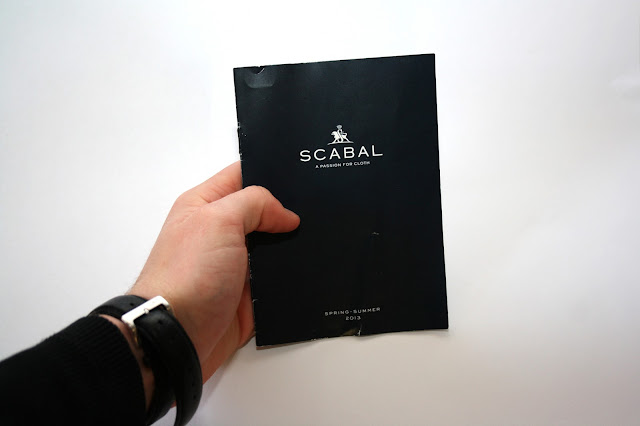
Scabal’s
Spring/Summer 2013 Lookbook and Magazine:
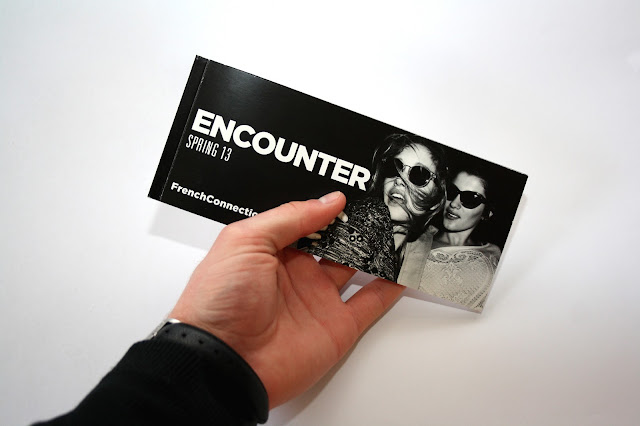
French
Connection’s Spring 2013 Women’s Lookbook:
Orlebar
Brown’s Spring/Summer 2013 lookbook:
As
well as these physical publications, I also browsed the Internet for creative
publications on similar topics. I found three publications that were relevant.
The first is a box that looks like a jacket, shirt and tie. The jacket opens to
reveal a tie and pocket, with each item, being a different material. This has
an interactive element that is a business card can be inserted and removed from
the pocket.
The
second is a Slovenian book entitled Psychologists, Psychiatrists and Other Fools. The cover for
this book looks like a section of a suit and shirt with the buttons on the
front and the button holes on the back.
The final publication I found was cald the Tailors and
was a concept for a publication about Gentlemen Criminals. The elements that I
really liked were the simple yet effective layout designs and the style of the
photograophs. The photographs are mysterious, dark, elegant and sophisticated
all at the same time, emulating the ‘gentlemen criminals’. This is a quality I
wanted in the photograps to go into my publication.
I also found a product, produced by Beams, that was a card holder and a pocket handkerchief. This is something I could possibly use when thinking about presenting my publication.
When I
was down in London I took photographs of Savile Row – the street itself – and
Dege & Skinner allowed me to take photos of their shop. This was extremely
helpful as it meant that all of the photos used in the publication would be my
own.
As
well as the photographs from my trip to London I arrange a photo-shoot to get
quality photographs of a suit. As I really enjoyed the style The Tailors publication photographs were
taken I produced my own using similar techniques. I did not want any shots of
the head or face that would reveal identity, as I wanted the focus to be on the
suit. I also did not want generic Lookbook magazine style fashion shots as I
wanted something more individual and original – this is why the photos are from
obscure angles and have an unconventional backdrop. The photos were taken when
it was dark using a ring flash so that it provides a very high contrast of
light and tone. As the photos were going to be used in black and white only
there wasn’t a need to worry about hue.
With the
entire content ready, I moved on to thinking about the design of the
publication and how it could be produced. I wanted to produce something that
was unusual yet kept the sophistication of the content.
I came
up with a variety of different possibilities:
After
reviewing my design possibilities, I decided on creating a publication that
could be folded inside a pocket-handkerchief and placed in the top pocket of a
suit.
This
idea meant that my publication was restricted to 80mm x 110mm. at this size it
will fit into the top pocket of a suit jacket.
Now
that I had a concept and content, I moved on to the designing of the
publication. The first thing I did was decided on name and front cover. I
wanted something that was simple and sophisticated. I came up with a variety of
possible titles and words I could use as the title:
Bespoke
Tailored
Tailor-Made
Suit
Gentlemen
A
Gentleman’s Attire
The
Gentleman’s Attire
Gent
Mister
Mr.
Impress
Impression
Sophistication
Sophisticated
Perfection
Class
Confidence
Tradition
Traditional
A
Gentleman’s Best
The
Gentleman’s Best
A
Gentleman’s Attire
The
Gentleman’s Attire
A
Gentleman’s Best
The
Gentleman’s Best
Tailor-Made
Tailor Made
Tailor
Made
TAILOR
MADE
TAILOR
MADE
Tailor
Made
With
possible title ideas I produced a number of thumbnail designs of different
titles, using different layouts.
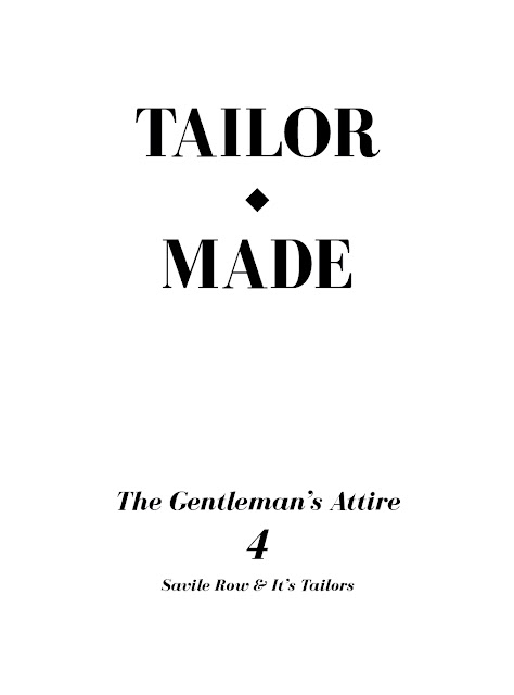
The
title and layout I settled on was simple yet sophisticated. The title I decided
on was, Tailor Made – The Gentleman’s Attire and the layout was a centrally
aligned type based design.
I also
did some initial design work, laying out photos and text. I wanted to present
my content and make my publication in the form of a lookbook. This style has
slightly glossy paper, large amounts of photograps and simple and effective
layouts.
At
this point we had a crit to see how we were getting on and what we still needed
to do. In this crit we presented the work we had already done and received
feedback on it. The feedback I received was very positive. The main change I
made from the crit was that my publication would no longer be on large booklet
and would be a series of 4 smaller publications. The reason for this change was
to break up the content, make it easier to bind and there are 4 suitable ways
to fold a pocket-handkerchief where the publication could sit inside.
As I had
decided to split my publication up into 4 sections I needed to redesign each
one. The four sections I chose to divide it into were; The Lounge Suit, Bespoke
& The Tailor, Style & Etiquette and Savile Row & It’s Tailors. For
the Style & Etiquette publication I wanted to highlight the different
styles of suit. to do this I traced over photographs of the different styles so
that the focus was on the cut and shape rather than the image.
The
final four publication designs were as follows:
I
proceeded to print the publications out to ensure they were the right size,
worked and to test my possible binding methods.
The
two binding methods I wanted to try were staple binding and saddle stitch
binding. I wanted to see how effective and how well staples worked
aesthetically as they were used in one of the lookbooks I had gathered during
my research. The result was very promising; it looked sleek, professional and
neat.
I
wanted to try and saddle stitch with two different threads, one thick and one
thin, to see which looked the best. The reason for saddle stitching was to try
an alternative method that reflected the content as well.
The outcome
of the saddle stitching provided a completely different feeling to the
publication. It did not look as neat or as professional and the threads were
either too thick or too thin.
For the
final finished publications I printed them on double-sided gloss paper to
emulate the lookbook professional feel and bound them with staples for the same
reason.


No comments:
Post a Comment