Modernist Graphic Design

The
first piece of modernist graphic design I collected was this piece entitled The Dot by Armin Hofmann, designed in
1965. This piece displays all the
fundamental modernist design - structure, grids, information, uniformity,
geometry, use of negative space and layout. The images are aligned in a grid,
with the text information also being aligned into columns. The information and
shapes are emphasized through the layout and specifically the use of negative
space, drawing focus to certain elements.

The
next modernist work is by Josef
Müller-Brockmann and is a poster for an art exhibition in Zurich. The overall
design of the poster is very simple and informative. Again, in keeping with modernist
design, the layout is very structured and grid based. There is also a lot of
negative space, focusing the views eyes on the information. The font used is
sans serif, which is very common within modernist design. Another modernist
design feature is the function of the hierarchy, where the most important text
is larger and bolder and the less important information is smaller and not as
bold.

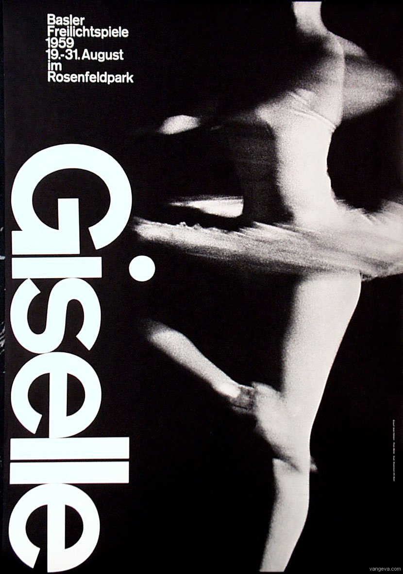
Another
piece by Armin Hofmann, shows the elemental features of modernist design. The
layout is very structured, use of negative space focuses on the information,
the hierarchy illustrates the most important elements within the design and
again the typeface is sans serif.
This
work, again by Armin Hofmann, combines another major part of modernist design –
photography - with the elements seen previously. As with the other works the
poster’s layout is very structured and simple. The text fits well with the
photograph, neither is detracting from the other and the hierarchy highlights
the most important information.

The
final modernist work is by Josef Müller-Brockmann and follows the other works
by having a very structured layout and uses a gridded system to present the
information. Again a sans serif font is used and all the headers and titles are
made obvious through their boldness and scale.
Post-modernist
Graphic Design

Post-modernist
graphic design is very different, almost the complete opposite, to modernist
graphic design. As demonstrated by this work of post-modernist graphic design,
the layout is extremely random, with very little structure at all. The type is
almost illegible and is overlapped in a collage-type way. The angles at which
the text is laid out clashes with each other and some is upside down. There is
no grid structure and the appearance is fairly complex and there is no
uniformity, geometry to the work.

This
work is by graphic designer Jamie Reid, the same designer who produced the God Save The Queen and Never Mind The Bollocks… album artwork
for the sex pistols. This work is again contrasting the regulations and
limitations of modernism. Although more legible than the previous work, there
is no formation or structure to the work. The text is positioned at odd and
different angles to each other and there are no clean-cut lines or edges.

This
piece of post-modernist graphic design is an album sleeve designed by Human
Empire. The work has elements seen in both the previous two examples, elements
that are common within post-modernist design. There is no structure to the
image, everything is seemingly placed where it fits and there is no grid format
as nothing is aligned. As with both of the previous works, this has a collage
feel to it. This feeling is created through the use of various different
processes and mediums all combined to produce the album sleeve. Juxtaposed with
the modernist style there is very little accuracy seen in these post-modernist
works, elements do not fit, have rough edges and do not look right next to each
other.

This
post-modernist flyer/poster has no resemblance to modernist design, and where
most modernist design does not age and still looks good today, post-modernist
design appears dated. In keeping with the post-modernist design, this work has
a very hand made quality to it. None of the text is aligned and is mostly all
the same size and weight. The image on the poster/flyer has a very rough feel
to it, none of the edges are accurate and the background does not fit the image
and the texted is just positioned where it fits.

This
final post-modernist work of graphic design is a front cover of Ray Gun magazine. Ray Gun is run by founder David Carson, whose work radically breaks
modernist constraints, through experimental layout, typography and imagery.
This cover has more structure than many of the other edition but still has a
very kitsch, post-modernist feel to it. The title of the magazine itself is
only partially visible with the ‘G’ arranged back to front. The other text is
partially obscured by the barcode as well as having two types of font layered
on top of each other and slightly offset so they are both visible. The
photograph also does not fit the page and elements stretched to fit the
publication. As with a lot of post-modernist design, the publication has a very
hand-made feel to it, emulating the collage effect seen in the other works I
have researched.
No comments:
Post a Comment