Primary
My
research will focus on Printed Text & Reading in the environment we live
in. The main elements of the environment that I want to look into are scale,
specifically large, and location. As primary research I have walked the streets
of Leeds looking for, and photographing, where printed text is used. As
outlined at the start, I want to focus on location and scale so whilst
collecting my primary research these are areas I have focused on.
The
most common forms of printed text found around Leeds are these pillars that are
plastered, on a regular basis, with posters for up and coming events. The
pillars stand around 2 meters tall and around 1 meter wide. They have 8 flat
faces that enable the posters to be pasted on to them. The Printed Text is
slightly larger than commonly seen, as it has to be readable whilst conveying a
large amount of information.


Another
commonplace to find printed text on a much larger scale is on shop fronts. This
is a much more commercial type of printed text. When this happens it is usually
the shop name and/or logo that is printed in large letters on the side of the
building. In the case of Jaldi Jaldi and Costa the text is printed onto glass,
meaning other buildings and objects are reflected. This is something that I do
not think is a good aesthetic.


Another
very common area of printed text is advertising, in this case, on billboards.
The reason I chose to photograph billboards rather than other advertisements is
due to the scale. I find that the larger scale works have a much greater
impact. Adverts on this scale need to be easy to read and therefore the key
information is much larger.

Another
place I found printed text was on the side of Leeds art gallery. As I found
with my secondary research and my experience of going to art galleries, it is
usual to have information about the exhibition printed onto the walls. This
makes the information easily accessible and readable. Out of all of the printed
text I found around the city, this was one of the most effective and aesthetically
attractive.

The
final and most effective printed text I found around the city was this text on
the side of boards marking out a building site. This is the most effective as
it is simple and clear and its colours create the greatest contrast. This is also
an interesting piece of text as it is only temporary whilst the building work
is being completed. Although this is not on a massive scale it is larger than
would usually be seen. In comparison to the other printed text in Leeds, this
has the greatest impact, followed by the gallery and the advert. When compared
to the secondary research, however, it is not as powerful as it lacks the
innovation of concept that printed text such as the Eureka Carpark and the
Design Museum Cafe have.

Secondary
For
my secondary research I have looked deeper into scale and how more simple
information can be displayed on a much larger scale. I have also looked into
how large amounts or more detailed information can be printed onto our
environment.
The
first Printed Text that I looked at was commercial related. Although it is
commercial, it is not common and generic. There is a flow and continuation
between the interior of the shop and the exterior, where the branding is shown
on the exterior and interior but can be see through both.


This
work, although not all of it is printed, shows the brand on different scales in
the environment. The central image has the identity printed on glass, showing
another dimension, where printed text impacts on our environment.


I
also looked at how large amounts of information and imagery can be printed on
our environment. The most common place that information is printed large scale
in our environment is in galleries and design spaces. The information is
usually kept to a single size so that it is legible and readable. The Design
Museum cafe has illustrations printed on the walls as well.


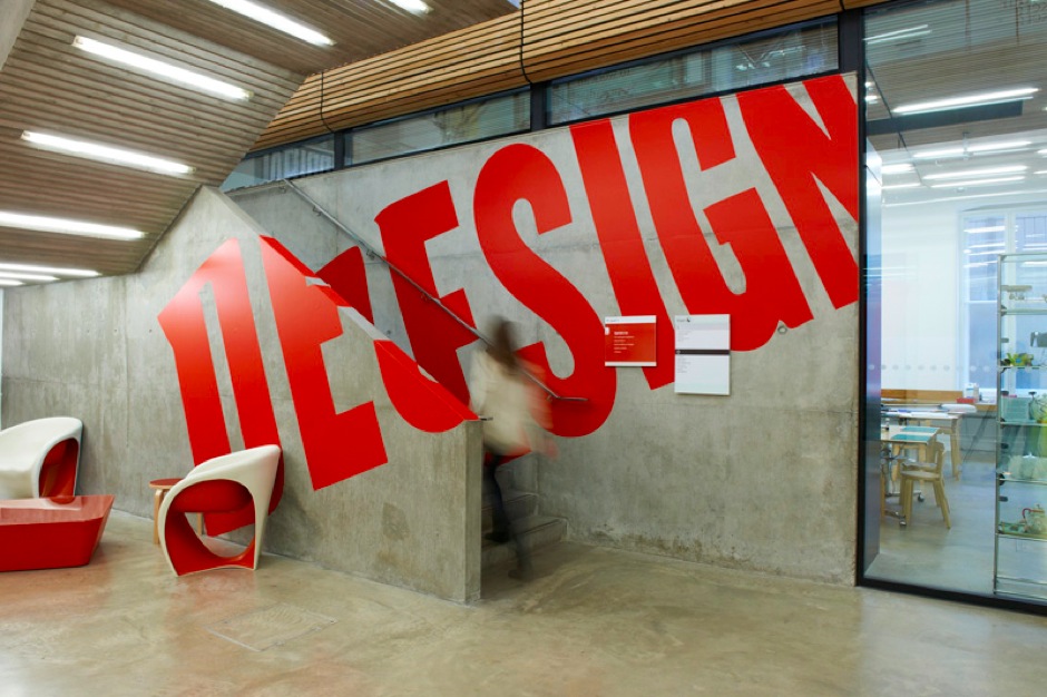
This
research is all visual and focuses on scale and perspective. Depending on where
you view the printed text it will either be perfectly legible or distorted.
This is especially noticeable in the Eureka Carpark, on the right, where the
directions are printed on the wall and floor. At the London Design Festival a
similar scale and concept was used.


Direction
I
want to move my research away from the poster stand and commercial promotional
side to printed text in the environment. I want to focus it down on the larger
scale work where there is an innovative, more creative element to the work. I
really like the idea of working on walls to a scale that would not be commonly
expected. I do not want to look any further into advertising, however billboard
size and scale is something I want to develop further. Although I chose the
temporary information for the store and the eternal wall printing from the gallery
as the most affective printed text in Leeds. When they are compared to other
images of printed text, found elsewhere, they loose their impact.
The
key focus areas I want to explore in greater depth and potentially develop work
from are:
- Scale
(Billboard/wall)
- Perspective
- Information
- Unusual/experimental
- Interaction
between printed text and it’s environment
Whilst
looking further into these areas there are also other elements that much be
considered, such as:
- Legibility
- Readability
- Communication
No comments:
Post a Comment