The Brands I looked at and analysed were;
Burberry
Hackett London
L. K. Bennet
Grenson
Vivienne Westwood
Whistles
Liberty
James Lock & Co
DAKS
Fred Perry
and a selection of Savile Row tailors
Burberry


The Burberry heritage part of their website is almost entirely photo based. It is very extensive, collection of information, however the actual textual content is very limited, usually only a sentence or so per image. You get a broad idea of the history of Burberry but no an in depth look. The design is also quite difficult to read and follow as the text is hidden away to the right-hand side (squeezed in as an added extra) and to go through the images you have to click down on two separate buttons. I do like how visual the timeline is, however, I want my timeline to have a greater feeling of scale and time as well a more in depth information.
Hackett London


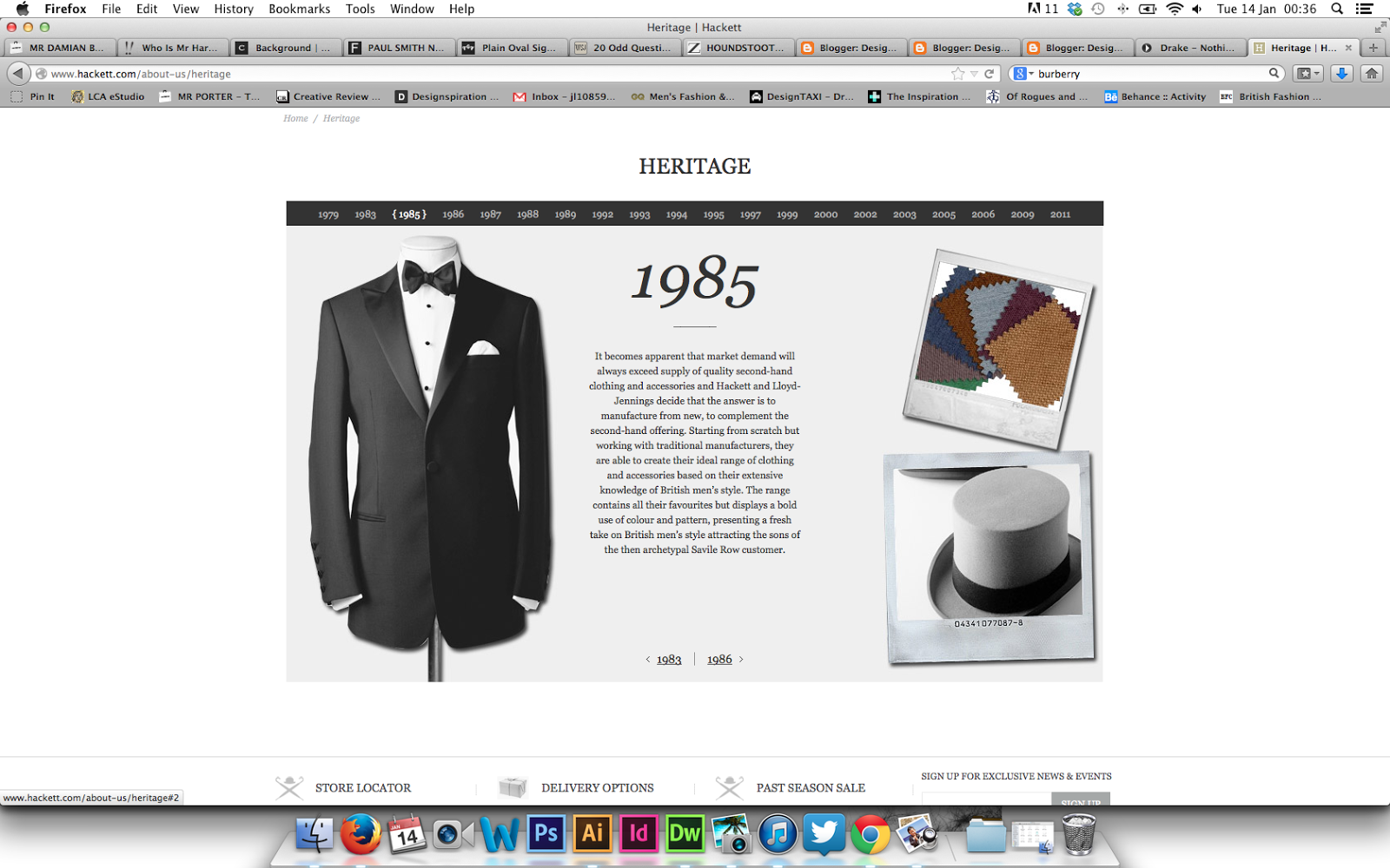


The Hackett London heritage section of its website is very in keeping with the brands identity. The layout id very simple, combining a simple column of body copy that is surrounded by images. I do not like the way the images are arranged, however, it is appropriate for the brand. The timeline is also arranged in a horizontal design, unlike the Burberry one which is vertical. I personally prefer the horizontal designand it is something I want to emulate in my timeline.
L. K. Bennet

L. K. Bennet's about/history is very limited and is only 3 paragraphs long. This was not a helpful design other that to show me how not to do it.
Grenson


The Grenson heritage and about page is more limited than I had expected. For a brand that seeminly takes its heritage very seriously, there is very little information, other than a few paragraphs and a selection of images. Similar to the L. K. Bennet website, this does not give me much to analyse, again other than what not to do.
Vivienne Westwood


The Vivienne Westwood heritage page is much more in depth with a lot more information on the brand. There are also a selection of photographs that can be looked through, however, it requires using a different scroller. The main issues I have found whilst researching so far is that these pages are poorly laid out and very difficult to navigate. This is a major issue I intend to address when designing my website.
This section of the website does not really reflect the brand as it is very structure where as the Brand and punk is not.
Another major issue with these pages on many of these websites is that they are very difficult to locate and you often have to scroll right to the bottom of the web page. As this element is the focal point of my website, I will not have a problem like this.
Whistles

The Whistles page is even more limited than the L. K. Bennet page with a small paragraph summing up the entire brand history.
Liberty


Liberty's has quite a reasonable amount of amount of information, however, it is presented very poorly. Presenting it as just a page of text removes and engaging quality or dynamic. This may suit the audience better that something with a more interesting design, however, it is very boring and would not be appropriate for my design at all.
James Lock & Co.


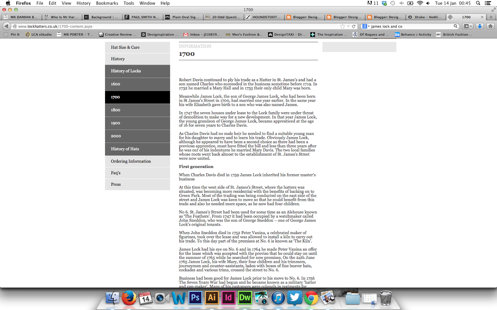


Similar to the Liberty's website James Lock & Co's website is almost totally body copy. The reason behind these websites being so plain and unengaging is due to their clientele and the fact they are extremely traditional companies that have not really moved into the contemporary world. This is again something I will not be taking through to my design.
DAKS


The DAKS website is a very well designed website, very functional, aesthetically pleasing and simple. The story of the brand page is still not very interesting and is just a column of text with a few images. It is not engaging or dynamic and I want my timeline to be both dynamic and interesting as it is the focal point of my website.
Fred Perry

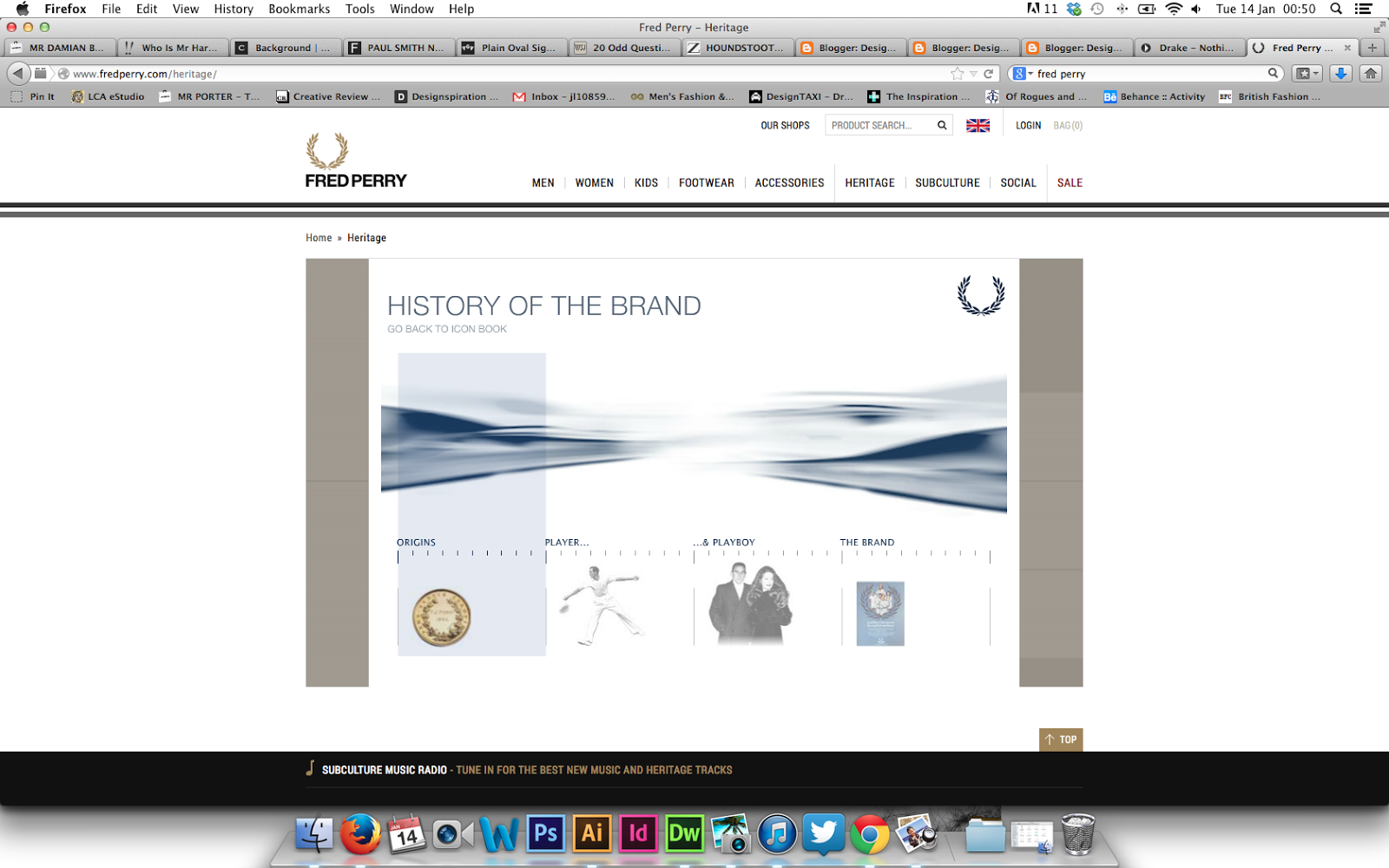


The Fred Perry website is appropriate for the audience and the way the information is displayed is easy to navigate and ready, although you do have to uses a variety of different navigation tools. Even though there are a variety of different sections they are quite brief and don't go into specific dates and detail. For my website I want to have specific dates, each with their own relative information.
Savile Row Tailors
Norton & Sons


Gieves & Hawkes


Probably the best design for content and interaction I have found, the websites history page imitates flicking through a book. I personally really enjoyed this as it is engaging, interesting and breaks the information down well. I want to experiment with this design for my website if it is possible.
Huntsman


The Huntsman website has a lot of information and a lot of imagery, however, the layout of the body copy is very heavy and as a user does not make you want to read it. On the other hand, the imagery is very goo, very interesting and visualises the mass of body copy. The design has some elements I want to take forward and some I will not. The elements I want to take forward are the layout of the imagery and how it shows the progression of the design and history. The element I wont take forward is the masses of body copy. I want to break it up so it is more manageable and interesting.
No comments:
Post a Comment