I have previously explored the concept of
anti-branding at A-Level. I looked into how a product was perceived with all
the branding removed and people’s responses to it. For this project I very much
focused on the product and it’s branding, however, due to the content of my
essay and my progression as a graphic designer, I wanted to look at a similar
point but in relation to advertising.
I am a reader of GQ magazine and within
this quarterly magazine a large proportion of the content is advertising. This
prompted me to look into other similar magazines, which I found to be similar.
A lot of both printed and digital magazines are full of adverts.
The adverts I chose to use where taken
directly from the GQ digital magazine. The adverts are aimed at the readers of
GQ so mainly focus on fashion (High-end/Highstreet), watches, cars, perfume and
various other high-end products. I chose to focus on these style of adverts for
several reasons; one, they were easily accessible, two, they are the sort of
advertisement that is superfluous to reality in the fact that we don’t need the
items that they are selling – a point discussed in my essay and finally they
are rich in brands and logo so there was a lot to work with.
I began to select adverts I wanted to
manipulate form he collection I had gathered. I chose adverts that I though
would be obvious where the branding had been removed. I originally started off
with a large number of adverts as I was not sure which ones would work
aesthetically when the branding and products were removed.
With my collection of adverts I began to
remove all of the branding and anything that obviously associated the advert
with a certain brand.
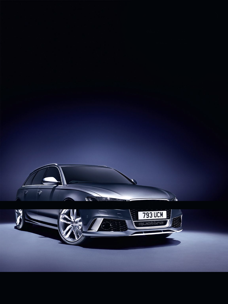
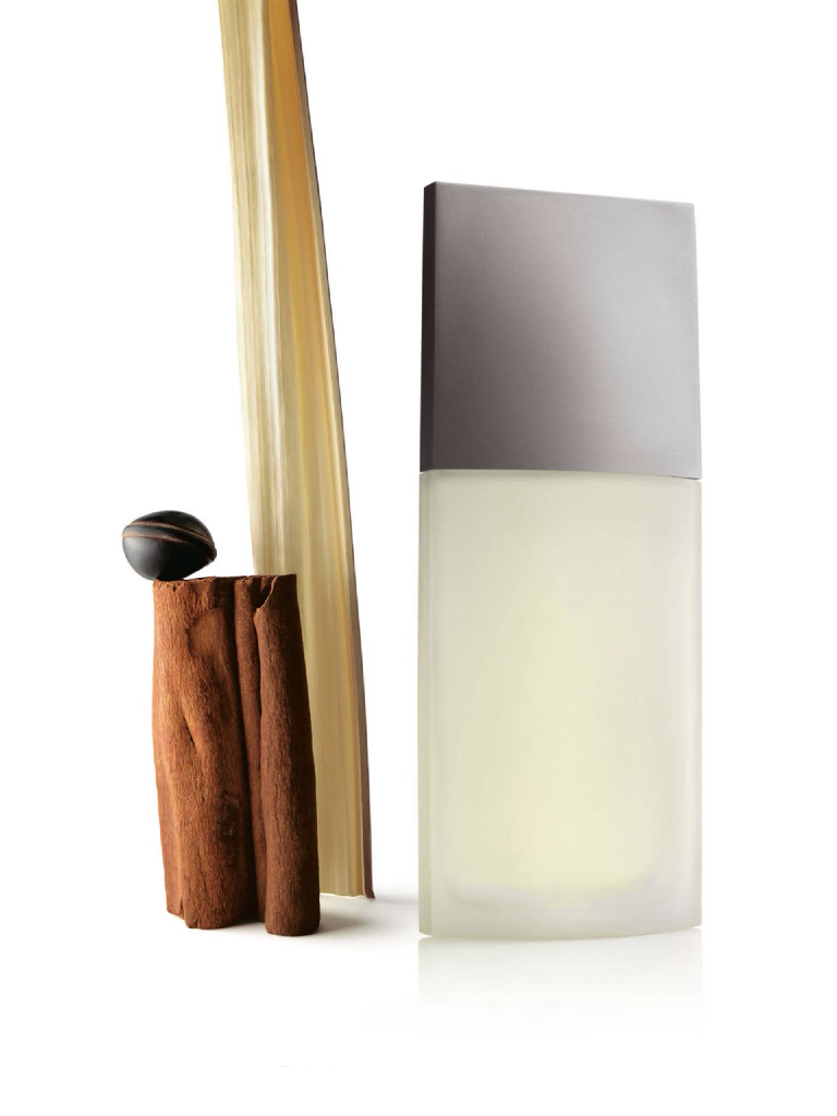
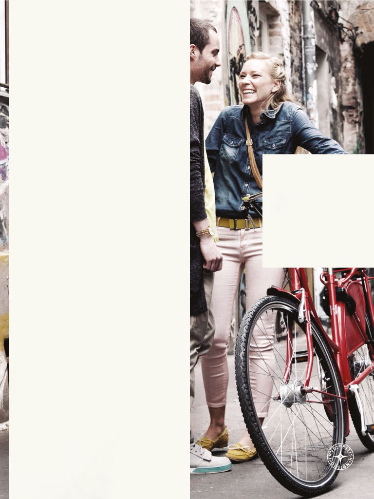
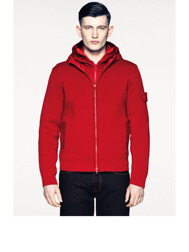
I removed the information in several
different ways. The most obvious and effective way was to block out the
information using either solid black or white shapes, depending on the image.
Another way I removed the information was by using the patch tool in Adobe
Photoshop. This tool replaces information with that from around it. This only
worked where the tool permitted and would not work for all of the images. The
final way I covered up/removed the information was by replacing it with the
background colour, again this only worked where the image permitted.
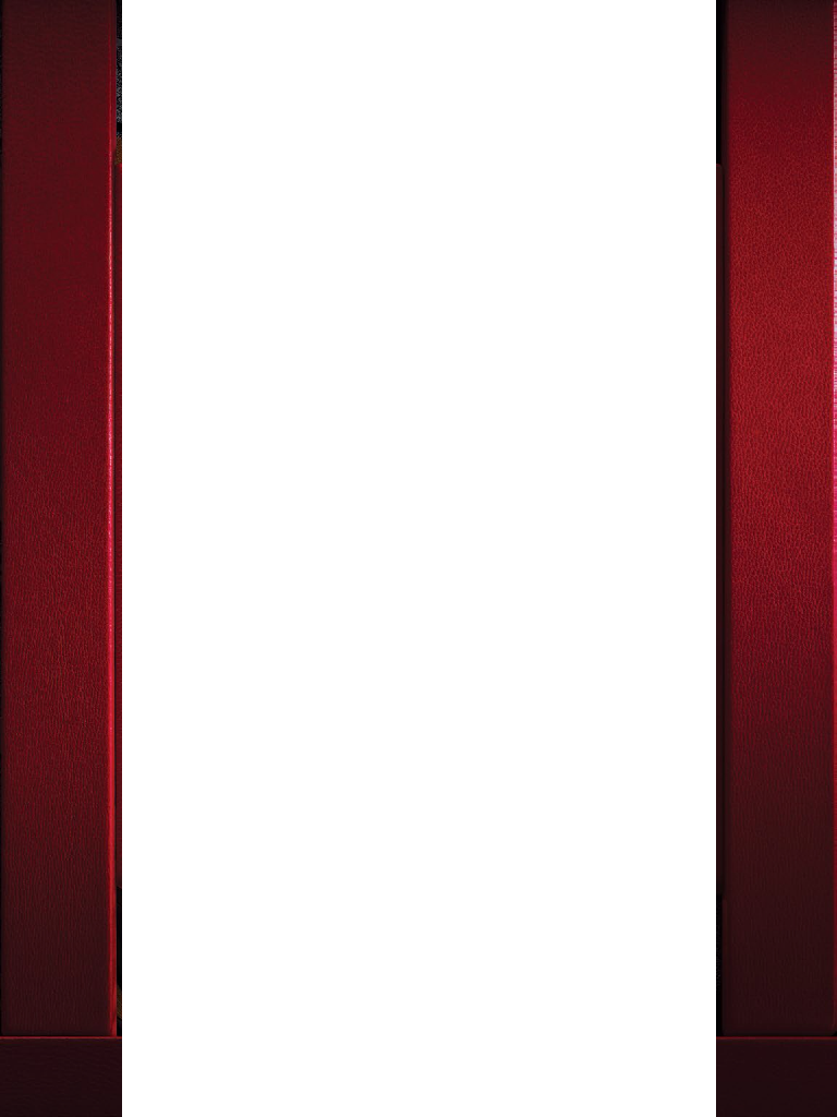
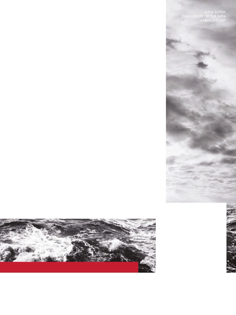
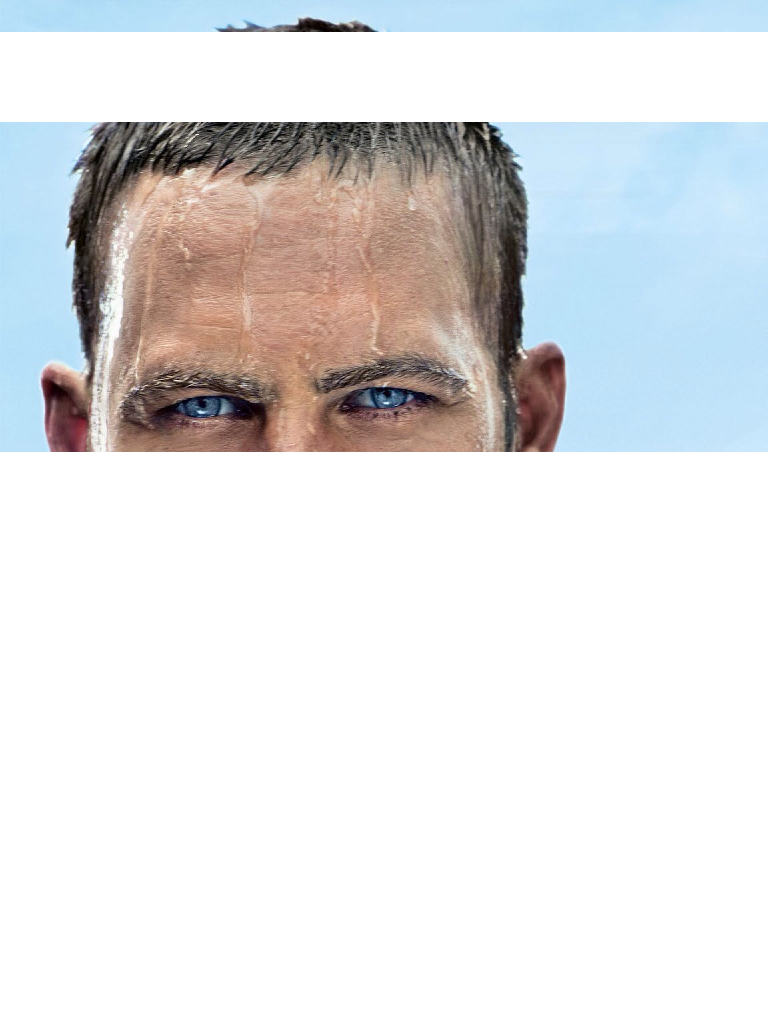
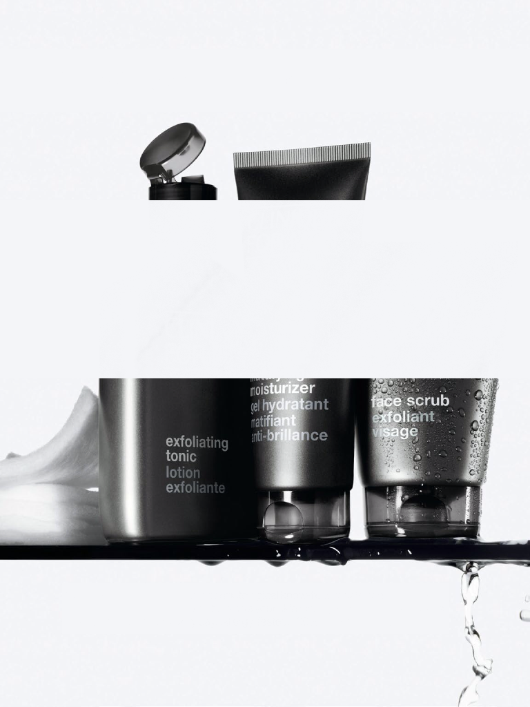
Where
the information was removed using full width white strips, it serendipitously
created an aesthetic that was very striking. It really broke the advertisement
up and was more noticeable that something had been removed and something that
was missing.
With some of the images there was so much
information that they became blank or the colour of the background.
Whilst I was removing the branding from the
adverts I also used this as a selection process. I originally had almost 300 adverts;
with the editing and selection I reduced that number down to just over 250. This
was too many images to put into a magazine as it would be difficult and costly
to print. I therefor decided to limit myself to 140 pages in my publication.
This meant I could include 140 adverts without it being too difficult or too
costly to print.
I originally wanted to produce a magazine
that was entirely full of adverts without any branding, however when thinking
this through, I decided on its own it did not have a point. I wanted to
exaggerate the scale that adverts saturate our society, however to show this
over-saturation I needed some content in my magazine. I chose to place my essay
sporadically amongst the adverts so that it was hard to read and hard to
follow. The essay itself only covers four pages however you have to get through
all of the adverts in order to read it. This left me with 136 adverts so I
remover the ones that I thought were least powerful and therefore least
effective.
As well as the physical copy of the
magazine I also produced a digital copy. On top of this I produced a digital
copy of the publication with the unedited adverts in it, so that you could see
what was actually missing and had been removed.
I had always wanted the publication to feel
like a magazine. I wanted to print double sided on a magazine glossy stock and
perfect bind all of the pages together. Due to time restrictions I was unable
to get the magazine printed on the stock that I wanted. This was somewhat
frustrating as it detracted from the magazine finish that I wanted, which in
tern detracted from the impact of the adverts without any branding.
Another issue that I had whilst producing
this publication was the image quality. As all the adverts had been saved from
screen they were only at 72 dpi. This was an issue as they would not print at
such a good quality. I up-scaled the resolution whilst constraining the size in
an attempt to increase the image quality. This worked sufficiently so that the
images did not deteriorate too much when printed.









































No comments:
Post a Comment