For
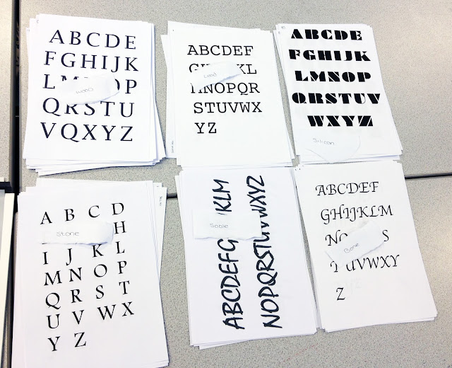
this session we were asked to collect 5 fonts with different styles. We were
then separated into groups of 6 and asked to separate all of our fonts out into
categories. The categories we chose where; serif, sans serif, script,
blackletter and graphic.
Serif Letters with a horizontal extension completing the
stroke of the letter.
Sans
Serif Letters without the horizontal extension.
Script Fonts/Typefaces the
resemble handwriting.
Blackletter Fonts/Typefaces resembling decorative gothic
styles.
Graphic Letterforms that could work as an image.
After discussing this within the session it was decided that Graphic was not an adequate category as
every letter in every font could be used as an image.
We were then asked o arrange our fonts into categories,
reflecting which method of production would have originally been used, had the fonts
been produced in the past. These categories were; stone, sable, bone, wood,
lead and silicon. Although they are all technically silicon as they are all
digital we were arranging them as if they had been produced using their true
method.
.jpeg)

No comments:
Post a Comment