As part of my
research for the Design for Print brief I looked at some newspapers, as this is
the format I wanted to produce my info pack in.
Rather to
look at all the generic newspapers, I chose to look at some more alternative
options.
The first
newspaper I looked at was The Antifoto
Manifesto.
This paper page
is 317mm x 456mm and the spread is 456mm x 634mm approximately.
This is an
uncommon size and probably custom.
The paper is
printed in a single colour – black – therefore only using one plate.
This paper is not bound, instead it is just folded.
This is a
mainly text based paper although it does have some photographs. I like the
layout of this paper, as it is simple and effective. I also like the use of hierarchy
with the font to break up the pages and highlight different areas//information.

The second
newspaper I looked at was an art and photography supplement called Symbol Paper for New Art.
It measured
260mm x 360mm for a page and 360mm x 520mm for the spread.
The paper is
a full colour CMYK print.
This paper is
bound with 2 staples.
I did not
like this one as much as the previous paper, however, I did like the way the
contents page was structured//gridded with small images of the actual pages as
reference.

The third
paper that I looked at was Portrait Salon 12.
This paper is
mainly a photograph-based paper with only a couple or articles.
Its
dimensions for the page are 288mm x 418mm and the dimensions for the spread are
418mm x 576 mm approximately.
It is a full
colour CMYK print and is not bound, only folded.
From looking
at this paper I like the way that the spreads that contain text are laid out,
this paper also has a good use of grids and negative space, especially on the
photographic pages. These are all elements I would look to incorporate into my
design.

The next
newspaper was called Line Magazine.
These
newspapers are, as I previously mentioned, not focused on the news and have
different and alternative content. Even though this is entitled a magazine it
is the format I am focusing on rather than the content.
This paper is
278mm x 390mm approximately and 556mm x 390mm approximately for a spread.
It is a full
colour CMYK print and the paper is bound with a staple.
This has some
really interesting elements to it that I like. The first is the combination and
layout of text and imagery – simple and basic yet effective. I also really like
the use of the double page spread in this paper. It creates a different feel to
the paper, especially when on spread is entirely image. The double page spread
are also printed right to the edge of the paper, something I didn’t think was
possible.
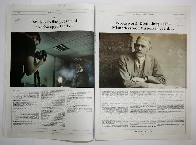
Our Times has a good use of the double page spread as well
as negative spacing. The arrangement of image and text is an element I particularly
enjoy.
The layout is
simple yet effective, there is no overload of information, which is found in a
lot of newspapers. A balance has been found.
The papers
dimensions are 288mm x 366mm approximately for the page and 576mm x 366mm approximately
for the spread.
The paper is
a full colour CMYK print and is not bound, only folded.

I really like the layout of this paper, specifically the interaction of text and image. The layout and positioning of the text and the photographs is unusual, engaging and interesting. The variation of the layout also keeps the reader interested throughout.
The dimensions
for this paper are 288mm x 401mm approx. for a page and 576mm x 401mm approx. for
a spread.
It is again a
CMYK full colour print and is folded and not bound.
Hypebeast newspaper is a more conventional size however it has an unusual stock. The stock is closer to antique or cartridge as apposed to newsprint. This gives the paper a much bulkier feeling, however, where the paper has been folded some of the ink has rubbed off.
The dimensions of this paper are 394mm x 285mm approx. for the page and the spread is 570mm x 394mm approx.
The paper is full colour digital print and is staple bound.


No comments:
Post a Comment